
How to Style: Eclectic Room Edition
Design Recipe: Let your "Statement Piece" lead the way.
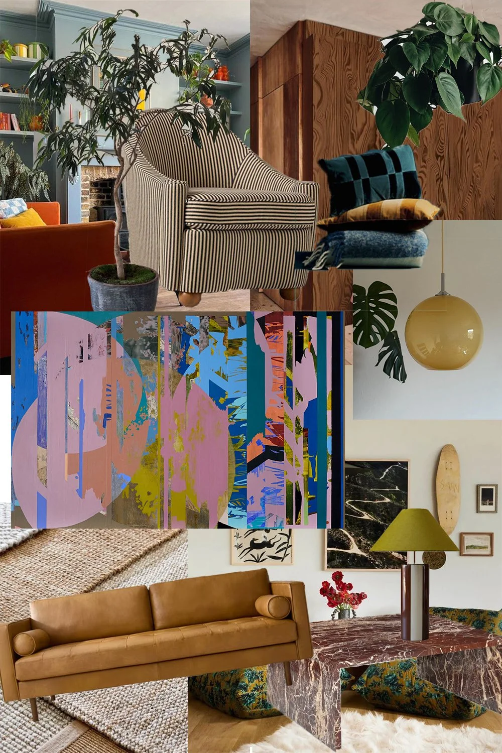
We have all heard the rule time and time again that art should be the final touch, but true eclectic styling is anything but following the rules. I recently put together this visual mood board for one of my boldest paintings, Hothouse, and I want to walk you through exactly how I designed this board, starting with the heart of the room: the art.
Start with the Anchor:
For my example I am using Hothouse, but it could be a piece of furniture, an architectural feature, a rug, or something as simple as a lamp. When you have a piece as dynamic and colorful as Hothouse, it doesn't just hang on the wall; it dictates the room. This painting is a blend of bold colors—deep electric blue, vibrant yellows, soft lavender, and punchy coral/pink—all layered with intricate textures and geometric shapes and shadows.
Instead of trying to "match" the painting with accessories, I used its core energy and color scheme to inform the vibe of the entire space. The goal was for the room to feel as layered, textural, and curated as the artwork itself. You can use the same mindset for anything you choose as your “anchor”.
Layer 1: Textural Neutrality
Texture does the work that color cannot and adds a level of intentionality to any space. To keep the bold statement artwork from feeling overwhelmed, I grounded the rest of the room with natural, highly textured elements. The leather sofa in a warm tan provides a rich, inviting neutral base that allows the painting's coral and yellow tones to pop. On the floor, a chunky jute rug adds organic depth and a tactile counterpoint to the smooth, painted surfaces.
Layer 2: Color Call-Backs and Repetition
Now, let's pull those specific tones out of Hothouse and let them travel around the room in a rhythm. This repetition is key to cohesive eclecticism.
Pink and Coral: Notice the soft blush tones in the painting. They find an unexpected echo in the rich, wine-red marble table and the vase of deep pink poppies.
Blue: The small but distinct patches of electric and sky blue in the art are reflected in the teal and petrol blue patterned pillows add a touch of warmth.
Yellow/Chartreuse: The vibrant ochre patch in the painting is amplified in the mustard pendant lamp and the playful chartreuse table lamp with the cylindrical base.
Layer 3: Eclectic Mixing and Unexpected Shapes
Once the colors are established, we can introduce patterns and styles that shouldn't work together, but do.
The power of a stripe: The central striped armchair is a classic. By placing it near the abstract painting, its strong, graphic lines act as a visual palette cleanser and provide a call to some of the linear structure of the painting. It also helps transition us into other bold patterns.
Juxtaposing textures: The slick, modern marble table (recalling the art's ‘cut’ edges) is paired with a plush, natural sheepskin rug and deep green botanical upholstered ottomans tucked underneath. The mix of smooth and soft, modern and traditional, creates contrast and interest.
Curated clutter: Finally, style with intent. The small gallery of art, the old skateboard, and the architectural plants (the Monstera and the potted tree) add the personal, lived-in layers that define an eclectic space.
The lesson? When you start with a powerful statement like Hothouse, every design decision becomes easier. It gives you a roadmap for color, a standard for texture, and a license to be bold.
Create This Look
Start with an statement anchor: Find your own Hothouse (or grab a print of mine!).
Choose 2-3 core colors: Pull them from the anchor and repeat them in accessories and lighting.
Mix your textures: Layer leather, jute, velvet, and sheepskin.
Add a classic pattern: Break up the abstract shapes with a stripe or plaid.
Go big on plants: Greenery connects all elements and softens hard edges.
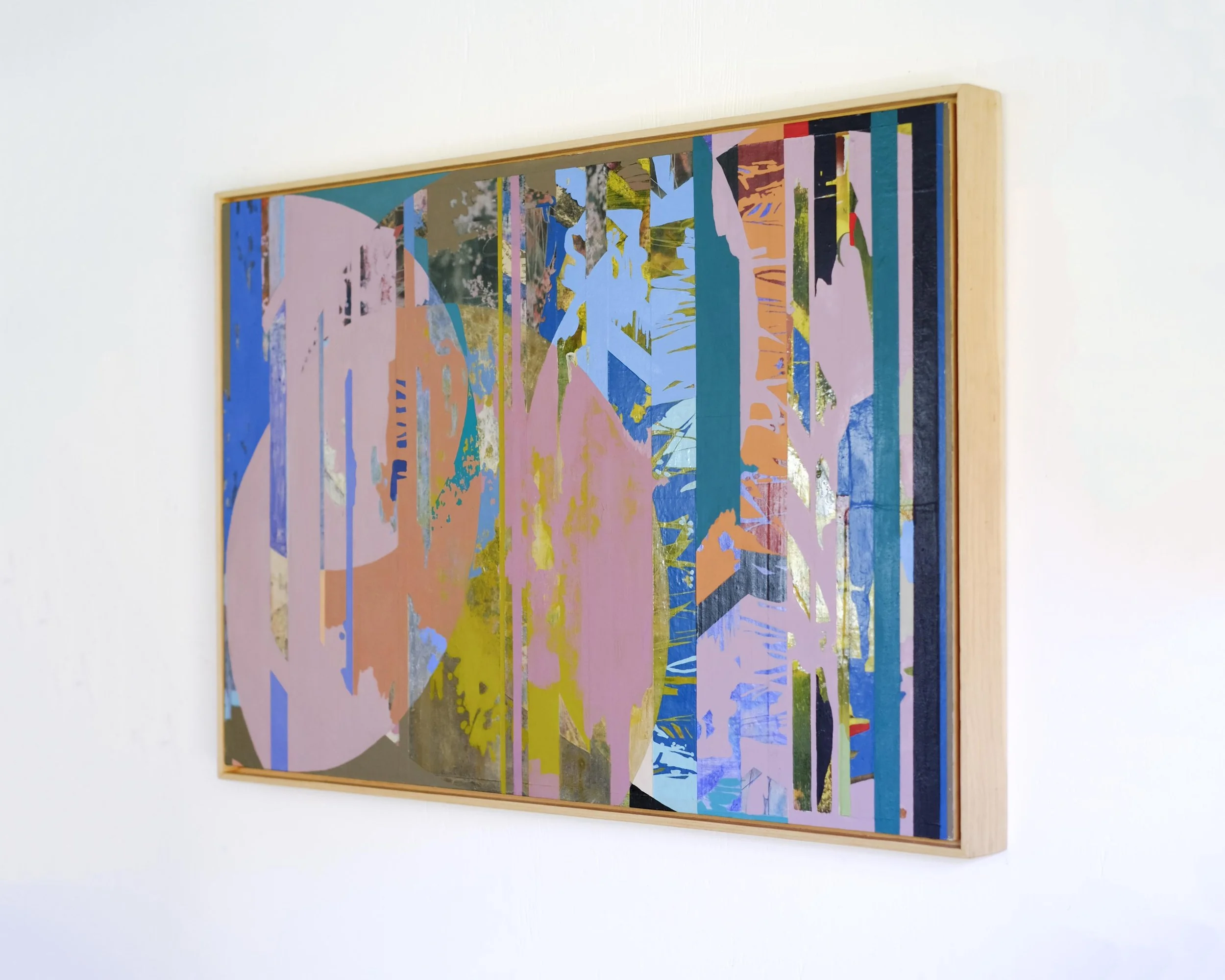
Learn more about the featured artwork in this post: Hothouse, 24x36”, acrylic, image transfers, collage on panel, 2023. Custom frame in pine.